


GameChanger
Game trading just leveled up.

Who We Are

Mobile Web Homepage

Sign in/Up

Hamburger Menu

Features

Verification

Design Roles
UX Design
Visual Design
Branding & Identity
Duration
8 weeks
Tools
Sketch
Figma
InVision
Adobe Creative Suite
Usability Hub
Maze
Google Forms
Deliverables
User Surveys
Competitive Analysis
User Personas
User Flows
User Stories
Sitemap
Wireframes
Concept & Identity
Logo Design
Style Guide
User Testing
High Fidelity Mockups
Clickable Prototype
Summary
GameChanger is a concept trading application that’s all about simplicity. Someone has what someone else wants, they message each other, work out a deal, and exchange items. Trades happen in a visual interface allowing users to see what people have and send an offer. Bartering is nothing new, but giving it a focused audience, easy posting features, and a modern feel helps bring this ancient form of business into the new era.
Problem
Games are expensive. Add to this the sheer amount of games released feels like a new one is here every day. As if that wasn’t enough, limited print publishers are making incredible must-own titles in very few quantities, with no single database to find them all. And if you’re a game collector, finding physical releases of games has you deal with bloated prices or old antiquated web-only apps. Or worse, some sites have you use confusing currency or “credits” and dictate the value of your merchandise.
Solution
GameChanger aims to change that. Its marketplace offers plenty of filters to narrow down the search to that perfect game, console, or collectible. They help traders see what someone owns and what they want allowing them to tailor a trade even before they send a message. Traders decide to accept offers or counter their offers from their Inbox. It also values verifying users to make sure transactions instill trust and build a better community. View the prototype to tour the core functionality or dive deeper into how this was created below.
Process
User Surveys
I started my project by exploring what potential users had to say about trading gaming items in general. I was surprised when I asked about whether the app should let people make trades with those who live far away. It wasn’t as popular as I thought it would be. But not having to deal with shipping, Paypal, payments, and the like, let me focus on the core experience instead of finding ways to introduce a 3rd-party payment system and shipping options.
- Nearly 60% of survey participants have never traded a gaming item
- Around 40% of people surveyed said they had 2-5 gaming systems
- Another 40% of participants said they owned 5 or more gaming systems
- When asked if they were interested in trading gaming items nearly 80% of people surveyed answered “Yes”
Most Wanted Features:
- App should be free to download
- App will let me complete trades with people near me
- App will let me see if users are verified
- App will let me make trades with several items at once
Competitive Analysis
I chose two game-trading platforms (Leaptrade and GameTZ) as well as two big marketplaces (Ebay and Craigslist) for my analysis. I knew that I could learn about specific niche problems with my first companies because they focused on trading within the gaming community, while I would learn a lot about setting up good marketplace options from Ebay and Craigslist. In the end, I wanted to take the simplicity of what Craigslist does, marry it with the gamer focus of GameTZ and Leaptrade but with a more modern look.

GameTZ
+ Free!
+ Gamer focused
- Outdated website
- Hard to get started

LeapTrade
+ Easy upload process
+ Versatile (buy-sell-trade)
- Trades need “credits”
- No mobile app

Ebay
+ Market leader
+ Millions of daily users
- Highest fees
- Bloated with features

Craigslist
+ No account necessary
+ Easy to search
- Unmonitored transactions
- Legitimacy of users/items
User Personas
The survey data and interviews allowed me to build three personas with different goals. Mike is looking to trade his games to get new ones. He is an expectant father and sees selling off his old games as a way to create a better home environment for his family. Javier is all about a good deal. He is a casual gamer who buys video games only when the price is right. Sophie is obsessed with collecting. She hunts down her favorite rare collectibles but often has to do so on many sites.

Mike
35/Married - Operations Engineer Manager - San Francisco, CA
Goals
Broaden his game choices
Purchase a different gaming device so the whole family can play
Find a new way to pay for games that don’t involve spending so much money
Get rid of gaming items to make room for his new baby
Frustrations
Wants to play different games but doesn’t know what’s out there beyond what he likes
Wants to trade titles but too many of his friends have the same games
With a new baby on the way spending money on a new game seems like a waste of money
His large digital library can’t be traded
“If I played different games my family could join the fun.”

Javier
28/Single - IT Specialist - Oakland, CA
Goals
Find cooperative games he can play with his girlfriend
Trade items on an occasional basis
Find more deals on games
Wants a trading experience that is simple and won’t be too involved
Frustrations
Meeting people for trades can be time-consuming
Lack of gaming means he doesn’t always know what games are good
Finds deals on physical games more often than digital
Games are expensive and he doesn’t have time to dedicate to finding good deals
“I like video games, but they can get expensive.”

Sophie
22/Single - Student - Hong Kong, HK
Goals
Find rare collectibles to add to her collection
Trade PC games with other gamers
Feel part of a community of collectors and gamers
See other people’s collections of games and accessories
Frustrations
Worried she may not see as much value as others because of where she lives
Finds it difficult to trade her collectibles online
Online communities sometimes don’t monitor conversations
“I want to collect all my favorite characters in one place.”
User Stories
Attaching the data to personas, now I wanted to create tasks that new and returning users would accomplish. Here any mentions of payments or bank accounts dropped to low priority since many users wanted transactions to be completed near them. Prioritizing these tasks helped me keep the focus of my app on things that were of the most importance. Some of the most important ones are highlighted below.
As a new user, I want to post an item I want
As a new user, I want to message someone with a trade offer
As a new user, I want to see how it works
As a returning user, I want to reject a trade
As a returning user, I want to edit what I have available for trade
As a returning user, I want to view my pending trades
User Flows
I created user flows that combined what my user personas wanted to accomplish as well as important high-priority items from the user stories. In the flow, I pictured Reviewing a Trade Offer this starting from the Profile page, but later I decided to move this flow into the Inbox instead. A trade is essentially a conversation between two users, so it makes more sense to keep this in a user’s Inbox than to clutter a Profile page with it.

Sign In

Sign Up

Add a Trade

Create a Trade

Review a Trade
Sitemap
Taking account of what screens I wanted to represent in my app, I made a sitemap with some notes about relevant content it could contain. Beyond assisting with the information architecture, it also helped to simplify what I was trying to build. Anytime you build a concept from scratch it can be overwhelming. I find items like these help keep the tasks manageable and while still giving me an idea of the big picture.
Wireframes
I started the wireframe process by sketching a paper version. It helped me keep my ideas clear because if I can’t draw them on paper, there’s no way I could do it in Sketch or Figma. After running some tests through a paper prototype, I moved on to creating digital wireframes. One of the key additions is an account completion section from the Profile page. I wanted a way for people to verify their accounts and add a trading item so I gamified this part a bit to help people create completed accounts. Here you can see these updated screens and how they compare to the original sketches.

Marketplace Sketch

Profile Page Sketch

Send Trade Sketch

Add Trade Sketch

Inbox Sketch

Marketplace Wireframe

Profile Page Wireframe

Send Trade Wireframe

Add Trade Wireframe

Inbox Wireframe
Branding & Identity

I know that growing a brand involves good brand recognition—starting with the name of the app. I thought of a few names like Bartur & Shwap, but I thought I should try to focus on my niche market of gamers with my name. I landed on the name GameChanger because I felt like it could immediately be recognized as a game trading platform. It was also a play on words because users would literally change their games. There’s also the concept of being a gamechanger or something that breaks new ground. They were powerful ideas that I thought captured the essence of the app.
Logo
Nintendo, PlayStation & Xbox have branding that conveys who they are. For instance, the Nintendo logo conveys friendliness and wholesomeness, while the PlayStation and Xbox logos evoke a futuristic and masculine aesthetic. Conveying a sense of what GameChanger is about starts with the name, but is grounded in a solid logo. Inspired by the concept of exchange, I seemed to gravitate to using arrows in some way to show that my app was about an exchange.

Exchange inspiration

Arrow inspiration
GameChanger Logo Sketches 1
GameChanger Logo Sketches 2
GameChanger Logo Sketches 3
Even after all the ideas I sketched, I struggled to create a logo. I was focused on the logotype and didn’t think much about the logomark. I wanted GameChanger to be instantly recognizable as a brand. Nothing I created screamed simple exchange. Deterred, but not defeated I went back to the drawing board and focused on simpler shapes like circles for the logomark. I was looking for inspiration in other circle-based logos like Mastercard and GQ. Starting with 2 circles, I played around with some arrow concepts until I landed on the current version of the GameChanger logo. After this, I added a clean, geometric type to the mark and created a lockup as well. Check out the animation here for a final look as well as the final versions of the logo below.
Logo final versions


Color & Typography
Creating a bold, gamer-centered marketplace I decided on a mostly black interface with a monochrome palette to give the app a modern, sleek feel. But if GameChanger was going to be bold, I needed a bold color. I chose red as its signature color because it demands attention, without doing much. Varying shades of red were also chosen to support the monochromatic color scheme. It’s also a subtle nod to Nintendo, which uses red as its main color. In my research, Nintendo products were extremely popular and users consistently favored this company over its competitors. Using this color presented GameChanger an opportunity to associate itself with an already positive and established brand.

I had been looking for opportunities to use a serif font as a headline and thought this may be a good time to try. I eventually narrowed down my choices to 4 options each with a unique contrasting typeface. Usability Hub helped me create a user test but I had no clear winner for a favorite so I decided to choose the typeface that best-represented GameChanger—a bold company that’s slightly playful. The ligatures of Raleway made me think of a serif font, but it was still a sans serif with a slight boldness to it. I decided to stick to one family because font pairing seemed too forced when I tried a few combinations.

Style Guide


Packaging these ideas together in a Style Guide, I showed examples of brand usage across a variety of formats. Making this Digital Branding Guide was a lot of work, but it set me up for success anytime I had questions about using type, logo or color for the brand.
User Testing
After adding all of the branding work to my wireframes I made the first version of the app. There were several changes I had to make based on my last few rounds of testing which would greatly improve the functionality of my final prototype.
Add a Trade
Originally I created a large button that floated on top of the Profile page so that users could add items to their trade list. These floating buttons were very trendy at the time and I thought there would be no better way to catch someone’s attention. And while it was eye-catching, something about it always felt off. When asked, many users could correctly identify the button was for adding something, but could not consistently identify what it would add. I worked on a way to keep this visible but also stay true to GameChanger’s look. In the end, I shrunk the size of this and added text so everyone was clear about what pressing that + would do.

Checking Inbox
I still had some users have a difficult time checking their Inbox. You can see from the heatmaps that many people did not know where to press next. I reordered items, changed font weights, added some spacing, and created a better way to show a new Inbox message. Shown here is the revised Inbox page as well as its heatmap showing users consistently clicking the proper area to check their new message. Data now helps me say confidently that I improved usability.
Sending a Trade Offer
In-person as well as remote testing, was useful in tightening up things I overlooked. As an example, even though the user in the video correctly created a trade offer, he thought he might be able to do it a different way as well. I knew that alternate paths are something that opens up options for users. As a result, I made a change that allowed users to access the trade offer screen by tapping on any of the items they would like instead of only by pressing the Trade button.
Final Prototype
Overall the prototype worked well. Under a strict timeline, it was tough to add everyone's feedback so I prioritized those that would make the most sense for the most important flows of the application. I was extremely happy to produce the quality of work I did here. Some of the changes included creating brand new screens to onboard users, as well as allowing users to skip these if they so wanted to. Other times I was nudging pixels around to clean up my designs. Have a look at a selection of the final screens and click the button to explore the final prototype of the app.

Profile Page

Add a Trade item
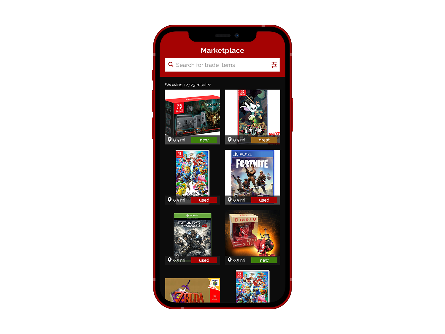
Marketplace

Trade Accepted

Trade Offer

Inbox

Reflections
Looking back at the project now, I think GameChanger would be a worthy app to help gamers trade items. I delivered on producing a free app that helped two people barter items with people near them at no cost. I also did my best to show that the catalog of gaming items could include consoles, games, peripherals, and rarities. The updated catalog is a huge selling point for this app. I tried to convey this idea by showing older games, but for this to really hit home I would have liked to show this catalog in action.
This project pushed my visual design skills to their limit. I was creating logos, iconography, and visuals like I have never done before in my life. I also created two sets of typography guides one for advertising/web and the other for in-app text. Visual design is not something I have been doing for a long time, but I love to learn new skills and I have a creative soul, so I think it’s a good fit.
Thinking about how this could be a legitimate business idea, I know that an app with no clear path to build revenue seems very idealistic, but some of the biggest apps of today started like that (Twitter and Facebook come to mind). They found ways to monetize only after they had millions of users who wanted their product. Thinking about it that way, users could potentially pay to spotlight their trade items or be alerted when particular items are available. It would be an easy way to monetize a part of the experience, completely optional while maintaining a free core user experience for everyone else.
If I had more time I would have liked to build out how to verify a user. Related to this, it would be nice to show a few screens of how someone would rate a user after a successful transaction. Verification was one of the most important features for users according to survey responses. I think I showed where I was going with that idea, but given more time I could show exactly what that would look like. Building a community takes dedicated members and all the big marketplace apps have some form of review or validation. I know that with those screens built, I could convey the important community aspects of the platform and help build a safe and trustworthy space for everyone.