


Method Media Intelligence
Ad fraud has met its match.
Duration
4 weeks
Design Roles
UX Design
Website Deployment
Tools
Sketch
Figma
InVision Freehand
Lucidchart
Deliverables
Wireframes
Deployed Website
The Team

Jonathan (me) - UX

Max - UX Lead

Effren - Design

Eunice - PM

Katie - Creative Director/Design
Summary
This was my first contracted UX opportunity for a client. Yes! Finally, a real product! I worked with the design team at Shion Studio to revamp, modernize and organize content for an ad-fraud detection company’s website. The final version of their site is light-years ahead of where they used to be. They now have a modern, concise, and easier site to navigate. As a bonus, I also worked to deploy this site and made some final code tweaks to make sure the site looked as intended.
Problem
Method Media Intelligence has positioned itself as having a unique product for advertisers to prevent ad fraud. Given that MMI has such a powerful software suite, their website did not reflect this. Their site was wordy, hard to navigate, and had no design concept. My task was to reorganize the content and streamline the experience by creating solid mockups. This was further complicated because the client did not employ in-house web developers and so they needed a site designed around Squarespace templates. Working with these templates was a big worry for Shion as this was something they had never done before. Challenge accepted.
Solution
Now the site gives Method Media Intelligence a much-needed facelift. Their stiff and uninteresting website now had a strong blue color anchoring softer shades of turquoise and cyan. The most relevant items are now on the navigation bar while less important ones were moved to the footer. Nearly all of the copy was reworded and memorable headlines served to pique interest. Long areas of text are shortened and broken up with impactful imagery and designs. More emphasis was placed on getting prospective clients to request a demo. I can’t wait to show you how it all came together.

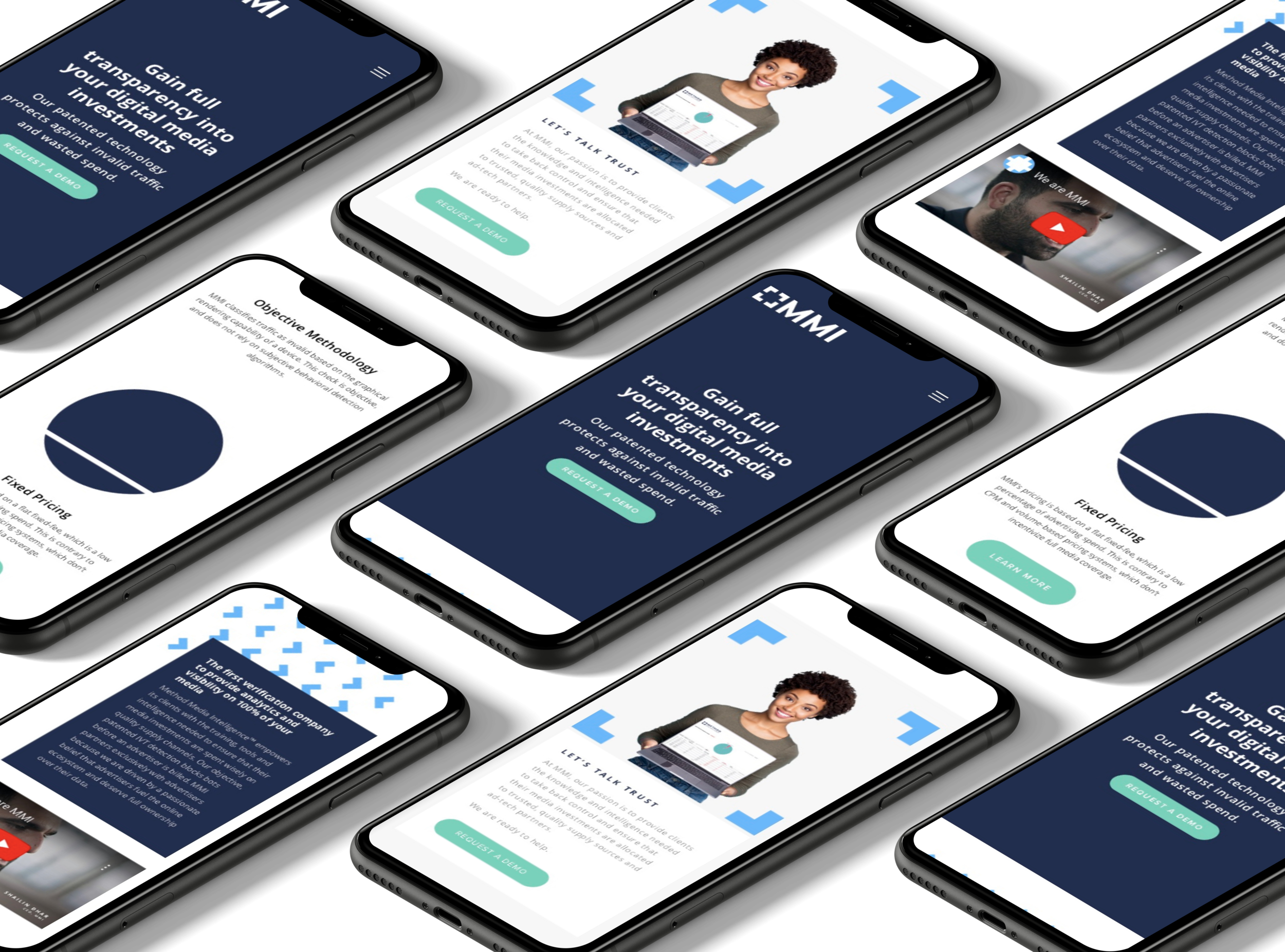
Landing Page

Product Page

About Page

Contact Page
Process
Timeline Considerations
“Ultimately design is about people—not a process...”
When I started I knew I would be the main UX person on the team. I was also working a full-time job already so my weekends would be where I got the most done. Given the tight deadline and my hectic schedule, there was little time to research users. I know, I know. Normally hearing what the users have to say always comes first, but the truth is there’s not always a budget for research. In this case, we lacked both budget and time. The client had a set deadline we had to meet and we just didn’t have the bandwidth working with such a small team. Not ideal, but this helped me realize we can’t always follow a step-by-step guide to solve a problem. Ultimately design is about people—not a process, so I knew if I kept the users top of mind we could still deliver an exceptional product.
UX Audit
Before I started the work of reorganizing content, I poked around and explored the current state of Method Media Intelligence’s website. I put myself in the minds of others whenever possible and tested it with the best user I had within reach—my wife. I’ve highlighted some of the original website screens below and my initial thoughts on how they could be improved.
Homepage
The homepage is the single most important page to a potential customer of a website. My first impression? Not great. I knew that having some images could take something from boring to bold. There was also inconsistent use of titles and the informational hierarchy was just off. It made it seem like the site was frankensteined together and lacked a sense of cohesion.
Key takeaways
The hero section needs work!
The copy is too wordy
Imagery can help break areas of text
Tame information hierarchy issues
Create a consistent design system
Navigation has a lot going on
Footer needs some spicing up
The information architecture needs a new blueprint
The Problem
The biggest problem with this page is the full-width text makes me want to give up reading any content. The content itself could be explained more succinctly to drive home important points. The lack of headline text makes focusing on what matters difficult and much harder to scan the page. Images are a nice touch and do convey some type of meaning.
Key takeaways
Get rid of the full-width text
Say more with less
No headline text makes scanning difficult
Images are fine but could be improved
Our Solutions
Here is where the client makes its biggest pitch to consumers in how their products can help them, and they managed to explain it succinctly. It’s so short in fact that the content is too sparse and rethinking content for this section is paramount. Also, there’s a strange tiny form in the bottom right. I think if the forms will be on multiple pages, better to have them in a pre-footer or something similar to maximize how often people see them.
Key takeaways
Explained the product well and with few words
Content is lacking on this page and may benefit from condensing other content into this page
The mini form may need to be rearranged or create a way to access the form from more pages to increase visibility
Product Guidebook is getting lost in the organization
Contact
One thing the website did have going for itself is several ways to contact the team. They have contact forms on their Homepage, Product page, and from the navigation. The bad part is they lacked a consistent design. Also, I’m pretty sure making someone fill out a page-wide form is a crime, right? The biggest question I have is what should the contact sections accomplish? Are they for saying hello? Is this for a product demo? Something else? The clients mentioned increasing requests to demo their product so that’s what I wanted to focus on.
Key takeaways
Plenty of ways to contact on different pages
Forms lack design consistency
Unclear about what the purpose of Contact is—simplifying this could increase people reaching out
Privacy Policy
This page has an identity crisis. It starts as a Privacy Policy page but then quickly turns into an explanation about one of their products. If this is to exist, it must be talking about either a privacy policy or just privacy in general. Lastly, the images don’t convey enough meaning to not be explained.
Key takeaways
The Privacy Policy content is too short to be a full-page
Rearrange Proactive Auditing content to a more relevant page
Images are confusing and out of context
GDPR
Honestly, I didn’t even know what GDPR was until I started this project. I quickly realized that while this is important, what is the use case for making this link from the navigation bar? Surely we could create a page that has more than 3 lines of text? This page will greatly benefit from being somewhere else.
Key takeaways
Prioritize important items to the navigation bar
Consider whether this page could be combined with other similar pages like their Privacy Policy
The footer is too large
Sitemap
The sitemap I created from the current design helped me visualize places that could benefit from reorganizing. Key in this new version would be a footer, where secondary content like the GDPR and Privacy Policy could live. Moving these had the benefit of creating a condensed navigation bar which helped users focus on what’s important. I also wanted more opportunities for users to request information and set up demos with MMI. I envisioned the new version having three ways to do this instead of only one like it previously had.
Original
- Too many items in the navbar
- Some pages should be condensed
- No real footer
Revised
+ Navigation has clarity
+ Added a Careers page
+
Requesting Demo now main CTA
Squarespace

Example of how content is added to Squarespace
Another challenge to overcome was to create a design within the limitations of a Squarespace template. I knew we had chosen a template called Bedford but assumed I’d have more customization options. Since my first wireframes were already finished, I quickly learned to tweak these designs keeping in mind what Squarespace would allow. Later on, I would discover that I had some control over this with code injections—areas within Squarespace that you can override with custom CSS. To keep things easy, I stuck to the blocks of preformatted design elements. As an example I found a video of how the content blocks were added in that version of Squarespace. Please note that is only an example.
Freehand Meetings

The team and I discussed my designs using InVision Freehand. I had used InVision to prototype but never to run a design critique. The Shion team zipped around the screen scrawling notes on my designs while I watched in amazement at how a real design team collaborated. They asked me plenty of questions and offered specific feedback to implement. During our kickoff meeting, the Creative Director let me know that I was to include updated copy on all pages. Presenting to the team, the diction was one of their highest praises about my designs. After my first critique, I couldn’t wait to improve what I had done so far.
Wireframes & Final Mockups
The biggest problem the website had was with the organization of content. The content was everywhere and there wasn’t a clear reason why. Moving content was the trickiest part of the entire project, but both the sitemap and UX audit gave me a good guideline. I also didn’t realize how important images would be to breaking up the content. My first attempts included some pictures, but Shion consistently pushed bringing in more and more images to liven up long sections of text. Whenever possible I would try to minimize text, but the team time and time again wanted more imagery. I’ve got selections of the final wireframes below as well as the final designs for reference.
Homepage
Now the navigation screams “click me.” The headline is much more to the point and accurately describes what MMI does while encouraging discovery. I was also successful in highlighting Requesting a Demo as the thing I want people to do. All the text on this homepage seeks to explain and build trust. The text is chunked into sections and this makes it easy to scan. I managed to create 3 ways to request a demo on the homepage without feeling like it was too much which was important because increasing these demo requests was a big push for MMI.
Key improvements
The navigation bar is simple and clear
Headlines are punchy and make people feel and act
Rearranged content from other pages to the front page for better delivery of messaging
Text is grouped in digestible chunks
Created typographic hierarchy to help organize content
Increased CTAs and their visibility to drive more demo requests
Product
This was where I really got to move some things around and get creative. There was nothing the eye could lock onto originally. Visual hierarchy is apparent now, allowing the eyes to scan and get an idea of the main areas of interest. Images keep the content interesting and engaging. I will say that the footer changed drastically from my original designs. It’s likely for the best as overloading any section is never good.
Key improvements
Content is condensed sitewide allowing this page to hone in on the products that make it unique
The hero headline is ready to engage visitors
Tons of images keep things lively but with a modern feel
The footer is less cluttered
About
Originally the clients wanted me to work on a Careers page linking from a “Join our Team” module. It was meant to gather interest from prospective employees but looks like it was ultimately cut from the final version. There are also some minor changes in the headline to increase the power of the language. The imagery really puts trust front of mind and the color scheme works to psychologically do the same.
Key improvements
Join our Team section not necessary
Headline and copy has been tweaked for effect
Images create a feeling of security and trust—essential in the world of ad fraud
Simplified the Team section
The color scheme evokes guardianship and assurance
Request a Demo
MMI had tasked us with exploring a scheduling module on their site. They even bought the Acuity Scheduling license, but eventually, this was scrapped. The final version became just a glorified form. I didn’t have much to do with the form creation but this must have been a last-minute decision from the client to simplify the process. It would have been great to test the page to see which users would prefer.
Key improvements
More emphasis on the fact that the demo is free
Completely shelved scheduling concept for a simple form submission
“Get in Touch” module replaces the “Request a Demo” module

See the final version of this design
Reflections
I feel elated at the final website design we delivered to the Method Media Intelligence team. As my first “real” job in the design world, it feels good to see my designs come to life beyond just a clickable prototype concept. MMI finally has a website that has caught up to the potential of their product. Their site is reorganized, revamped, and rebranded. The images help humanize all that they do and bring a design flair their site was heavily lacking.
One of the biggest wins for this project wasn’t even on the client brief. The copy which was created by me, but inspired by their original site has withstood the discerning eye of both our team and the clients. It’s not something I thought I was going to handle in the project, but I am agile and a quick study. A few more of these projects and I might become a UX Writer!
Being a member of the Shion team was great. They taught me about communication, pitching designs, implementing feedback, and using new tools. I also learned to embrace setbacks and constraints—they’ll never go away, so better learn to deal with them. Having created wireframes before, it was interesting to have a team of professionals not even bat an eye when I submitted them. I’ve only created a handful of them so far, but the team valued my contributions as if I had been a veteran of UX and I appreciated their insight and candor.
One of the biggest regrets for me in this project was the lack of direct research I did. I asked the Shion team what happens after we hand over the final versions of the website and they said, the clients take the site and they usually never hear from them again. I also asked whether they had any data to support the new design is an improvement over the previous one. They regrettably do not seek this information usually, but the client was a college friend of the Creative Director. Informally the client admitted that both traffic and demand for demos have increased. I hope to keep providing solutions for users in my future products and will be sure to use every ounce of experience from this project to make sure the next one is even better.