


Stash
Cloud storage is boring. Stash makes it fun.


Design Roles
UX Design
Visual Design
Branding & Identity
Duration
8 weeks
Tools
Sketch
Figma
InVision
Adobe Creative Suite
Usability Hub
Google Forms
Deliverables
User Surveys
Competitive Analysis
User Personas
User Flows
User Stories
Wireframes
Concept & Identity
Logo Design
Style Guide
Moodboard
User Testing
High Fidelity Mockups
Clickable Prototype
Summary

Memes, gifs, and funny videos are a unique form of communication. And while Silicon Valley heatedly exchanges spreadsheets and documents for the big meeting, millions of other people share a silly picture just because it’s #ThrowbackThursday. The goal of this project was to bridge the usability and ease of cloud storage with all the interesting ways people communicate.
Problem
Through my survey research and interviews, I found that some people found their cloud storage options daunting. They associated these apps as more “businessy.” They also didn’t see a benefit from them since they didn’t use file storage daily. They did, however, have a massive collection of images and stockpiled them in their text conversations, photo library, and social media, but these places made it hard to find the right file when they needed it the most.
Solution
Enter Stash.
Stash was created to store and organize the files people share the most often—pictures, gifs, memes, videos, and anything else they care about. It’s easy to use, approachable, and never takes itself too seriously. It organizes content automatically or allows users to do it for themselves. It’s a modern solution for the even more modern problem of having too much stuff.
Process
User Surveys
These surveys sought to discover what frustrates cloud storage users and what they enjoy about the service. Not to be left out, I also wanted to get the opinions of cloud storage averters. I hypothesized that I could address why they stayed away and increase the potential users of my app. I was especially struck by how many people said they didn’t use cloud storage at all—yet many of them were storing large amounts of pictures, gifs, and memes. These files might not have been important documents for work, but they were important to their daily communication. Unlike a traditional cloud storage application geared towards documents, there was no clear targeted solution to organizing and storing the files they used daily. Instead, they were haphazardly storing them in text conversations, photo libraries, emails, and direct message threads. This observation helped guide the rest of my app into a more focused solution that gave it a unique identity and an audience.
Survey Data
What cloud storage features are important to you?
In which domain of your life do you mainly use cloud storage?
Which feature do you rate most favorable within cloud storage?
- Users overwhelmingly voted Easy to Use as their favorite feature of cloud storage
- 83% of users value Uploading Files and Category Organization as their top cloud storage features
- Content Creation ranked last in features users would enjoy about cloud storage
- 75% of survey participants state they mainly use cloud storage for personal files
- Nearly 20% of participants stated they didn't use cloud storage at all
Competitive Analysis
Although great products in their own right, Dropbox was too enterprise-focused, Google Drive was bloated with features, and Pinterest—although simple to use—did not support all file types. I imagined an app with the cool factor of Pinterest but features more akin to Dropbox and Google Drive. Taking account of the research so far, I was able to create an ideal solution: an approachable, easy-to-use application that helped users categorize and upload their files effortlessly.

Dropbox
+ Holds biggest market share
+ Variety of sharing options
- Only 2GB free storage
- Too enterprise focused

Google Drive
+ 15GB free storage
+ Free document creating tools
- Privacy concerns
- Google product ecosystem

+ Visually appealing
+ Simple Organization
- Lacks support for all file types
- Lack of file view options
User Personas
The goal of any persona is to humanize data in a meaningful way. Data helped me create two personas to drive the project further. One persona was frustrated by not knowing where specific files were located. My second persona hoped there would be a way to help organize their files with little to no effort.

Chloe
22/Single - Retail Specialist - San Francisco, CA
Motivations
Keeping in touch with trends and being the first to know important social media news and information
Wants things to be fun and uncomplicated (like Instagram & Snapchat)
Managing phone storage as she has a large photo library but not a lot of places to put them
Frustrations
Hearing the word “cloud” puts her on edge
Storage on her phone is a problem and deleting content daily becomes a chore
Spends too much time looking for images within her phone
“I have so much stuff....I don't know where to find it.”

Raymond
29/Single - Marketing Manager - Oakland, CA
Motivations
Getting things done efficiently
Technically minded; relies on gadgets, apps, and smart devices to keep his day organized
Needs access to files and information around the clock
Frustrations
Would rather not spend time organizing files
Scheduled commitments don’t allow a lot of free time
Balancing his work and personal life is a challenge
Wants apps to work with little effort on his part
“It would be amazing to have things work automatically.”
User Stories
To minimize scope creep I created user stories for new and returning users of my app. It helped me to focus on creating a minimum viable product. Here’s a taste:
As a new user, I want to create an account
As a new user, I want to upload a file
As a new user, I want to see why this would benefit me
As a returning user, I want to save my account information
As a returning user, I want to be updated on changes to my account
As a returning user, I want to see my files visually
User Flows
Having some idea of what people want to accomplish, I prioritized creating flows for some of the most pressing features like account on-boarding, uploading content, file sharing, and collaboration. I differentiated some of the flows based on web or mobile, but in the end, only ended up creating a web prototype.

Account Onboarding

Saving & Uploading

Email File Sharing

Real-Time Collaboration
Wireframes
Taking account of the data I’d gathered, I built a basic minimal version of what the site would look like. I wanted large page-wide images with a focus on simplicity. Once the wireframes were done, I made them clickable and created the first working version. I tested this version with a few people and it was quite eye-opening. One of the biggest takeaways for me was that people were confused when it came to organizing content. In one particular test, I had to give more hints than I wanted to—clearly I was making this too hard for my users! I also noticed that both the collaboration and share file processes were nearly identical. I condensed that flow into one process that would allow a user to choose and minimize confusion.

Homepage

Sign Up

Dashboard

Share Menu

Add Content

Collaboration View

Save a File

File Successfully Moved
Branding & Identity
I started my branding sketches focusing on the sharing aspect. These sketches led me to the name EverShare. With feedback from peers and industry professionals, they weren’t in love with the idea particularly because it was a little too close to another competitor’s name. Pivoting, I decided to focus on the storage aspect instead. I looked around my living room and thought about all the way I stored things on shelves, boxes, and drawers. Below, you can see how I ditched “Breeze Bin” and “Cinch Stash” and went with a much simpler name—Stash. It’s a great feeling when you land on a name and it just fits.
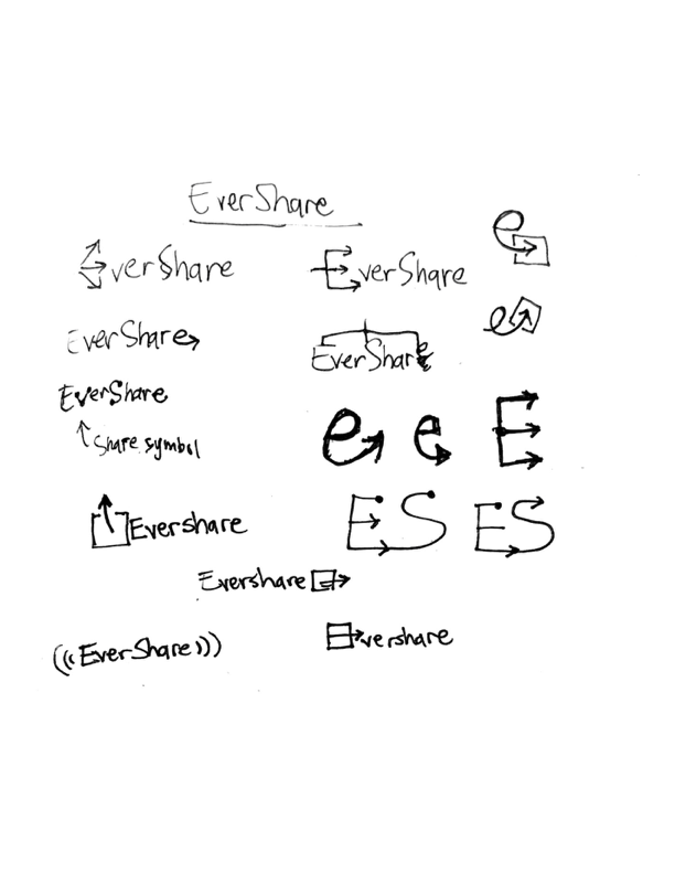
Evershare Logo Sketches

Evershare Mindmap

Share-Everyone Word Association List

Cloud Mindmap

Easy-Storage Word Association List

Stash Logo Sketches
Logo

From my initial sketches, I really enjoyed the drawer images I drew and created this first logo concept. I thought it delivered on the easy-to-use concept and worked well as an image everyone could recognize of a desk drawer. What better place to store your stuff?

After thinking it over a bit, the logo was solid, but I thought it could convey more friendliness. I rounded the edges of the drawer and chose a more approachable font. I adjusted the kerning, the spacing of the logotype relative to the drawer icon and decreased the stroke to better match the typeface. They may seem like tiny changes, but these little details make lasting impressions that will represent the brand for years to come.

Color & Typography
I chose a navy blue as Stash’s main color to embrace the pre-established cloud marketplace, but chose a lighter blue and rose to compliment and contrast. These colors also help the app have a fun and approachable aesthetic. I’m trying to appeal to as many people as I can here. Starting with a blue base color helps appeal to everyone since it has been shown to be both men’s and women’s favorite color.

Choosing Quicksand as a font for the logotype, I also tried using this as the larger font for headlines. I felt like it tied in the branding and worked in-app as well. Complimenting this font I originally had IBM-Plex serif, but its versatility left me wanting more. Even though I’m supposed to be contrasting fonts, I ended up choosing Montserrat—also a geometric sans-serif—because it just played better with my aesthetic and was more legible at smaller font sizes.


Style Guide

To get a sense of how color, design, voice, and typography would work together to create the Stash brand, I developed a style guide. I focused on the voice of Stash, as this is a pivotal piece of what makes Stash different than other cloud storage companies. While competitors seize an opportunity to focus on a concrete goal for file storage like collaborating on an expense report, Stash has a much smaller goal. Stash is a place to store their favorite stuff so that they can quickly find it and share it.
Moodboard


Rounding out the last bit of branding, I pieced together a moodboard to establish what users should feel when they visit the site or use the app. Quirky and fun design inspirations helped convey the important emotions- joy, playfulness, and fun.
High-Fidelity Mockups
Combining my wireframes with my branding concepts, I began to create the first high-fidelity mockups for Stash. You can see I was trying to go for a fresh, fun, hand-drawn vibe. These versions of the screens would go through a fair amount of testing after being turned into clickable prototypes.


User Testing

Based on user feedback of the homepage being a bit sparse, I decreased the scale of the type and imagery bringing things back into proportion. After a few tests, I also noticed some inconsistent use of color. Sometimes I try too hard to create interest when all I really need to do is create consistency. Several participants gave feedback about notifications and their positioning, and how it was too obtrusive. Here are some before and after comparison gifs as well as final walk-throughs and changes of the major tasks.
“Sometimes I try too hard to create interest, when all I really need to do is to create consistency.”

Homepage
Added colored navigation bar on homepage to create variety to the mostly white design
Created more visually interesting graphics based on some users saying design was “too simple”
Detailed key features on homepage because some users didn’t quite understand what Stash did

Sign In/Sign Up
Shortened the size of the footer because it was quite large in comparison to the header
Changed the placement of some of the navigation links to put more focus on sign in and sign up
Used color and placement more strategically to better highlight calls to action, error states and notifications

Dashboard
Moved notification banner to the top of the page to let users view their content while still being notified
Shrunk the sidebar and changed its color to maintain consistency across landing page and the dashboard
Created more ways for users to change how they view their content in the dashboard


Reflections
At first, this project was going to be a simple clone of other cloud storage apps. But in the process of trying to do that, I began to care about a real solution for the files that my users sent to each other. Files and images go back and forth so quickly that while conversations are more visually interesting, they are also taking up much more space and make it hard to keep things tidy. It feels good to create a solution that takes into account the current communication landscape instead of trying to fit what I think my users should be organizing.
If given more time I’d like to iron out more of the sharing aspects. There is plenty of room to add functionality for more robust sharing and collaboration. I would have also like to show how my application would automatically store images and categorize them for users. I’m bummed I didn’t have enough time to flesh it out and it’s an appealing feature for folks who are too busy to do it themselves. I was only in the early stages of this, but I also wanted to have a place for comments. After all what good is a fire meme if you can’t share it with anyone? However, my biggest regret was not making this a mobile app. I have a few mockups for a homepage and sign-in, but given the social aspect of sharing and how often people have their mobile devices with them, a fully-featured mobile version could be an amazing interface for people to save their files.
While the project brief had specific ideas about collaboration, potential users I surveyed had very different ideas about what they wanted out of an app like this. Once I asked about their frustrations and investigated how they used storage on their devices, the app began to take shape. It was important for me to help people and meet them where they are instead of making them fit into what I was building. I hope in the future I can help companies shape products to put their users first.